HG Capital is a privately held real estate investment firm and long-time client of WebSight Design. In late 2014, we partnered with HG Capital to redesign their website.
HG Capital's heritage dates back to 1946 in the U.K. Nearly 70 years later, the firm continues to provide capital to experienced partners. HG has a proven track record and has supported the acquisition and development of assets with an aggregate completed value over $1.8 billion.
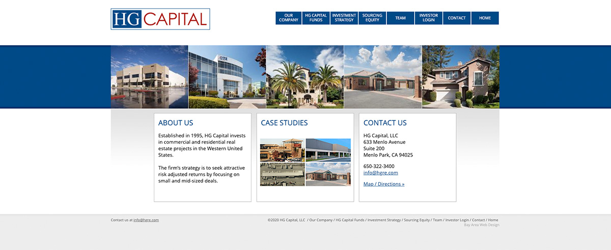
When designing the new website, one of HG's objectives was to replace generic stock images with HG-provided photos of their own real estate investments. A static banner on the homepage displays five of these photos. The redesigned website stays true to HG's branding and classic colors: blue, red, white, and grey. Given that it was important for HG to efficiently manage and update their own content, WSD developed an administrative backend that puts HG in the content driver's seat.
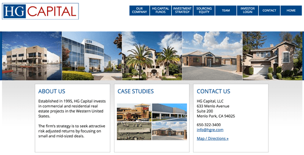
A final and very important goal of the HG website redesign was to create a website that was responsive on mobile, or any device. With increasing numbers of professionals using smart phones and tablets, this is always an important consideration.
Visitors to HG's website will note that the focus is on rich, informative content rather than elaborate design features. Relevant information is reached via the streamlined navigation bar at the top of the page. As visitors explore topics in the top menu, the categories change in the left navigation to match the active page. HG's website provides prospective investors with important and thorough details about HG's strategy, sourcing equity, and team of principals, managers, and advisory board. Proprietary information for existing investors is secured via a unique login and password.


