Great design is an essential part of effective communications. So much so that websites are often intentionally designed with content in mind. And one of the most subtle yet impactful ways designers keep a customer engaged online is through typography.
By carefully selecting the right font type, font pairings, and font sizes, designers create a content connection with the customer while intentionally drawing attention to crucial areas of the site. From edgy, modern, or bold to light and delicate, fonts contribute substantially to brand perception by conveying vibe and tone.
To help share the font love, here is some insight on font types, our favorite fonts, and where to find them. Enjoy!
The Basics: Serif and Sans Serif fonts
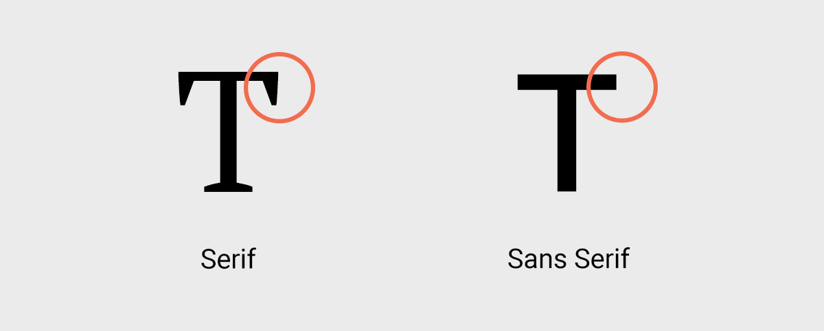
There are two core types of fonts, serifs and san serifs. Serifs are the small lines attached to the edge of letters, and sans serifs are fonts without (sans) the lines.
Sans serif typefaces are more modern and were designed to be easy to read on-screen, making them a good choice for body copy and navigation. A complimentary serif font, usually in larger type size, works well to set apart headlines and block quotes. The serif can provide a website with a particular character (often business-oriented, well-established, more formal), while the easy-to-read sans-serif can fill out the paragraphs.
Examples of great serif and sans-serif pairings
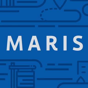
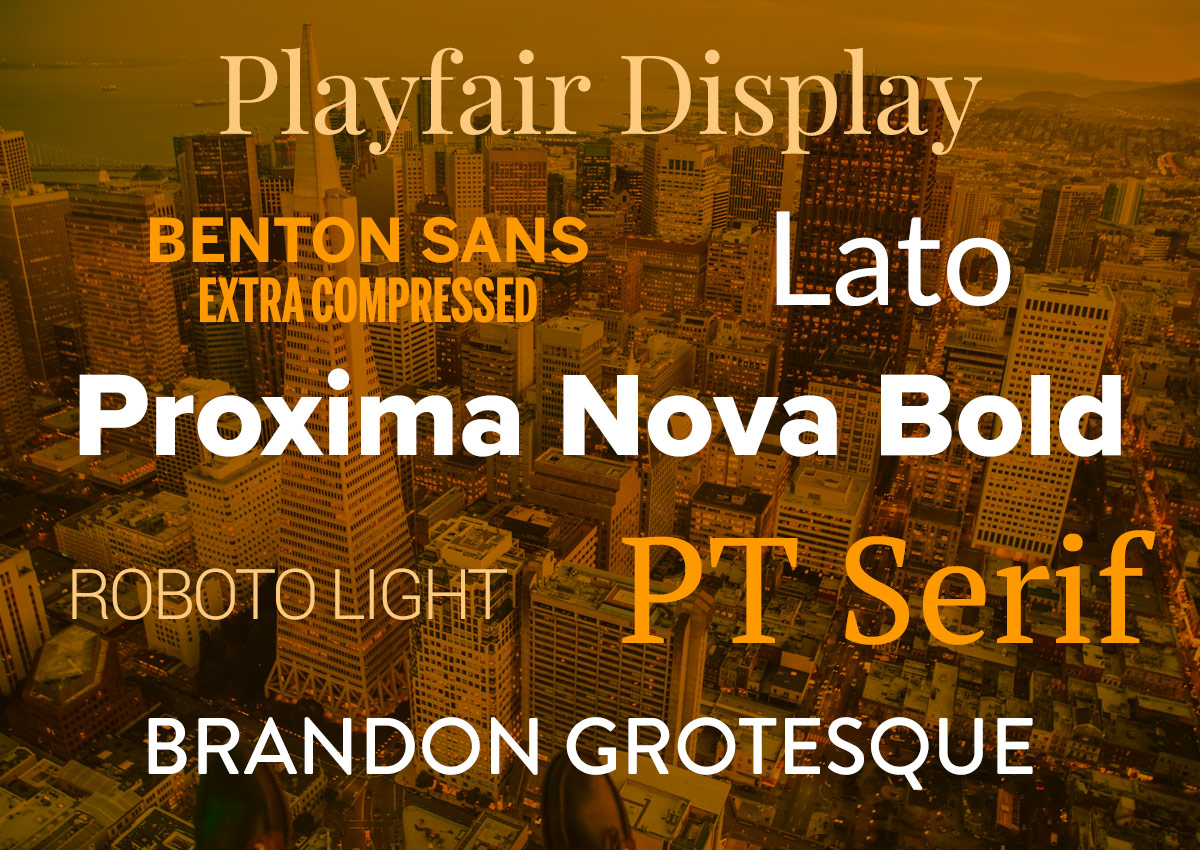
MARIS MLS: The Saint Louis-based Multiple Listing Service (MLS) uses PT Serif and Roboto on its website. Both PT Serif and Roboto are free via fonts.Google.com. Visit marismls.com to see this font pairing in action.
Rebecca Hoffman: San Francisco real estate agent Rebecca Hoffman uses Lato and Georgia on her website. Lato is free via fonts.Google.com. Check out Rebecca's website at rebeccahoffman.com to see why we enjoy this font pairing.
Lynn Finnegan: The Bay Area native and San Francisco real estate agent, Lynn Finnegan uses Playfair Display and Arial. Playfair Display is free via fonts.Google.com. Go to lynnfinnegansf.com to see what Playfair Display and Arial look like together.
Pairing two sans-serifs
Mobility Matters: Our clients at Mobility Matters use Brandon Grotesque and Avenir; both are sans-serif fonts. Some sans-serif typefaces look great in large sizes or all caps but become harder to read when used as body copy. Mobility Matters uses the approachable-looking headline font and logo font, Brandon Grotesque. However, the typeface switches to Avenir for body copy, which would be difficult to read in Brandon Grotesque. Paired this way, the fonts convey a friendly vibe while having a cohesive, rounded style that is legible even on tablets or smaller devices.
While Brandon Grotesque and Avenir are not free fonts, stop by mobilitymatters.fit to view the sans-serif pairing.
One-trick ponies
Some type fonts contain a large variety of weights and styles. By using regular and condensed styles and varying weights from light to bold, you can create different looks for headlines, callouts, buttons, and body text. Using the same font family removes any worry about headlines and body text "matching." Here are a few examples from our clients.
The Strat: Golden Entertainments popular hotel and casino in Las Vegas, uses Benton Sans Regular and Extra Compressed. Visit www.thestrat.com to see how using different variations within the same font family looks.
Aquarius Casino Resort: The Laughlin Nevada casino and resort chose Proxima Nova Bold Regular and Extra Condensed for its website. Both Proxima Nova Bold Regular and Extra Condensed are available via fonts.adobe.com. Browse aquariuscasinoresort.com to see how this font family looks online.
Darcoid: Oakland California steel supply company, Darcoid, uses Lato from light to heavy on its website. The Lato font family is available for free via fonts.Google.com. Explore darcoid.com to check out the Lato font family.
Choosing the right fonts to reflect your brand online isn't easy. The art and technique of selecting, pairing, and arranging type to be appealing takes a good eye and design expertise. When in doubt, reach out! Our designers are always happy to help.
WSD Services
API Development Content CreationContent Management SystemDigital MarketingE-Commerce DevelopmentE-mail MarketingHostingIT ConsultingLead GenerationProject ManagementStrategic AdvisoryWebsite DesignWebsite DevelopmentWebsite Maintenance WordPress Management