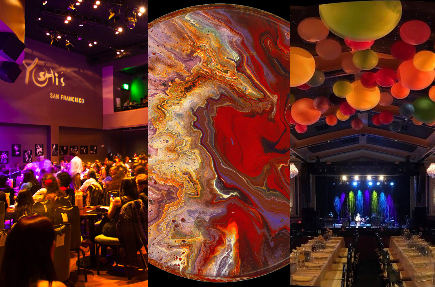
Staying relevant in an ever-changing landscape of the entertainment world is a challenge for every musician and venue.
Websites for the entertainment industry present opportunities to highlight show dates, current news, press, and media. Ideally, the assets and information are prominent and easily accessible for fans and patrons.
Event schema is one of the supported structured data types by Google Rich results which makes a website more visually appealing in the search results, increases your organic presence, and ultimately attracts more clicks.
What is Event Schema?
Event Schema makes it easier for people to discover and attend events through Google Search results and other Google products, like Google Maps. This feature provides:
- More interactive results: Your events can be eligible to be displayed in the event experience on Google, featuring your logo, description of the event, and more.
- Increased chances of discovery and conversion: People have a new way to interact with your event posting and click through to a site.
Additionally, these websites aim to communicate the artist's or venue's identity and create a consistent brand via image, design, style, color palette, and font choice..
At WebSight Design (WSD), we have a history of developing professional websites for high-profile clients in the entertainment industry. Let's look at three of our top artist and venue websites.
Legendary Grateful Dead Drummer Mickey Hart
Mickey Hart joined the legendary cult band, The Grateful Dead in 1967. He is a mainstay in the evolution of drumming, beats, music science, and sound. Because there are so many dimensions to Mickey’s music, we created a home page that communicates each aspect without overcrowding.

We featured Mickey’s icon, the drummer with Grateful Dead lightning bolt, top left to establish Mickey’s identity and legacy as an artist. A small pull-down navigation menu is fixed adjacently. Below is a slide show spotlighting the latest news and related media, which keeps the visitor up to date with the most important information. Lower on the home page, we break the content into specific categories for the visitor to hear, see, discover, and read more about Mickey's interests and music.
Toward the bottom, we bring it full circle by spotlighting some personal quotes and words from Mickey. Like Mickey’s artistry, the site feels organic, personal, and multi-faceted while highlighting Mickey’s current goings-on.
Yoshi’s: World Class Jazz and Sushi
Yoshi’s has been a mainstay in the Bay Area jazz scene for over 40 years. From its humble beginnings as a North Berkeley sushi bar, Yoshi’s has become one of the world’s most respected jazz venues.
Yoshi’s site is all about the calendar. The WSD team of designers built a site that showcases upcoming talent and events. Because of the volume of performances, the user interface (UI) needed to be user-friendly so that Yoshi’s staff could easily update the calendar and media.

Another key feature of the site is easy navigation to purchase tickets. The slide shows, and calendar itself all make it easy to click through and buy a ticket.
Performance, Academics, and Community: UC Theatre
WSD’s Design Team partnered with the UC Theatre to create a site that visually had both an academic and artistic feel. Like Berkeley itself, the site draws upon a range of cultural, intellectual, and historical influences that are tied together with the black and gold color theme, a UC academic crest, and iconography.
Similar to Yoshi’s, the site has a focus on events. The home page showcases the acts chronologically. Each date incorporates an image, basic show information, and links for more information and tickets.

Additionally, the site contains a wealth of information about the theater and community programs offered at and through the UC Theatre. We wanted the site to encourage getting involved through education, donations, volunteering, or joining the newsletter.


