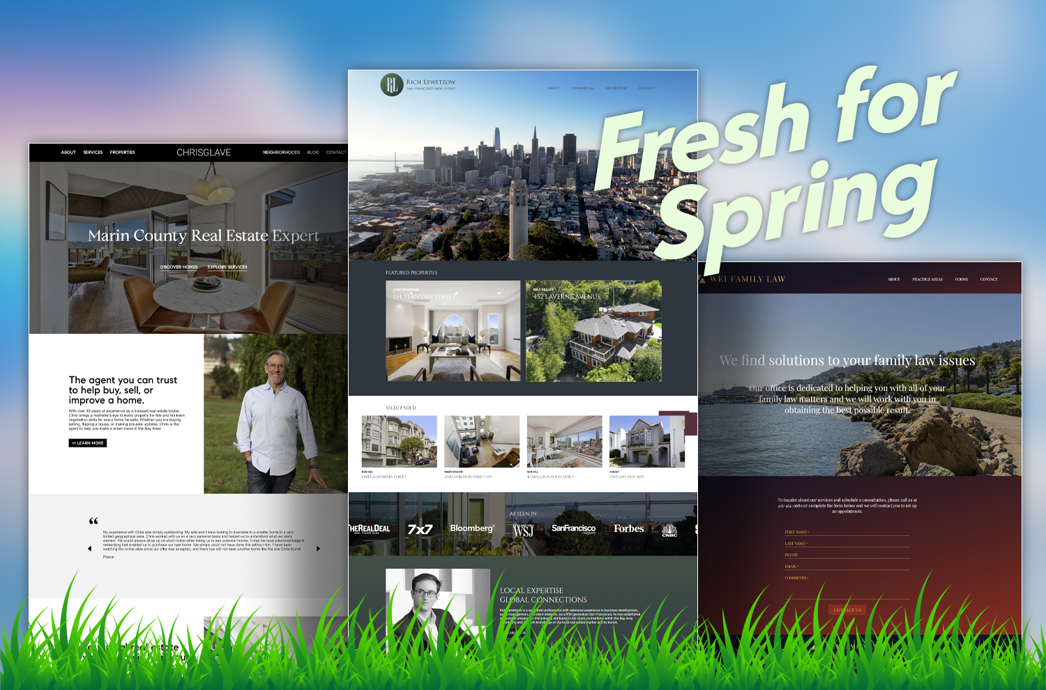
Spring is in full swing in Northern California and we are pleased to announce several fresh website redesigns.
Today, when rapidly evolving technology is the norm, a website’s user interface and experience can become quickly outdated. There are many reasons that brands come to us for a website redesign — everything from a floor to ceiling rebrand to migrating to a different framework.
Here are a few of our Spring '24 launches — now in full bloom.
Chrisglave.com
Chris Glave has been a WebSight Design (WSD) client since 2016.
In 2023, Chris decided it was time to invest in a new website design and backend. The new website was developed on our latest Yii-based Content Management System (CMS) and is fully responsive.
For this iteration of the site, font updates, a black-and-white color scheme, and content blocks align with the Compass brand. New photos add flavor and personality. Unlike many realtor websites, Chris’ site has a well-maintained blog, with curated content.
Weifamilylaw.com
Wei Family Law's expertise includes Child Custody, Child/Spousal Support, Property Division, Enforcement of Orders, Prenuptial/Postnuptial Agreements, and Mediation.
WebSight Design originally designed a website for Wei Family Law in 2016 when it was known as Mah Wei Law. In 2023, the firm rebranded as Wei Family Law and in 2024 we redesigned the site to reflect the firm's new name.
Alex Wei had definitive ideas about the color palette that he wanted: red, black, white, and gold. We created a bold design and logo with those colors. From a programming perspective, we deployed our Yii base code, specifically articulated for attorneys. The Content Management System includes modules for Practice Areas, Attorneys and forms.
Richlewetzow.com
Rich had a handful of example sites that spoke to the new, cleaner, full-screen look he wanted. The black-and-white of many of his competitors did not appeal to him and to that end, we designed a blue-and-green color palette that reflects the city of San Francisco.
Our design team updated the San Francisco skyline logo for use in printed collateral. We created an “RL” mark for Rich to use in digital media.
The back end also received an upgrade and now offers a way to separate commercial from residential properties.


