INDUSTRY: Real Estate
Laura + Kristin
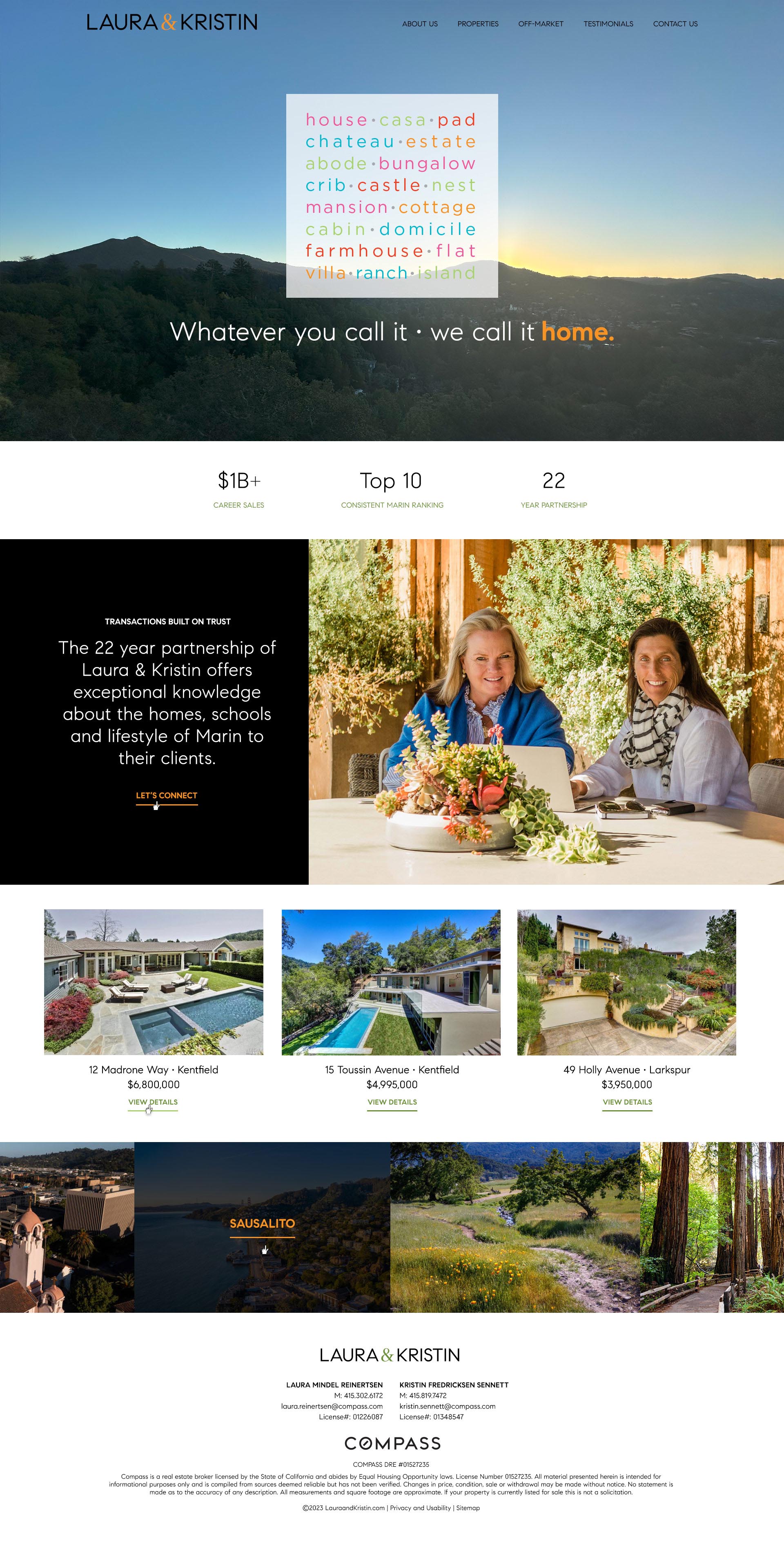
How do you combine the bright, almost neon colors of Laura Reinertsen and Kristin Sennett with the minimalist black-and-white branding of their brokerage Compass? That was the design challenge for lauraandkristin.com. The two-person team has had their logo - the multi-colored block of different ways to say "home" - for many years, but wanted to update their site's visuals and integrate it under Compass's umbrella.
With strategic use of two colors pulled from the logo block, we were able to add "pops" throughout the black-and-white base. The strategically used orange and green text worked to highlight the greens and warm tones in the photos throughout the site, weaving everything together with vibrant visual threads. Laura and Kristin had great photography, which gives a personal touch and professional vibe to the site.
The site also boasts a robust CMS that allows the client to update content and keep property listings up-to-date. Prompts to sign up for email lists or contact the team are liberally spread throughout the site to encourage conversions. The site works as a showcase and a property marketing tool, increasing Laura & Kristin's credibility and online visibility.
- FEATURES:
- CMS
- Design
- Development
- Hosting


